

DMV of California

My Role: UX Researcher | UX/UI Designer
Group: Crystal Juarez, TJ Jesrai, & Danielle Nedivi
Duration: 2-Week Sprint | Concept
Tools: Sketch, InVision, Figma, Miro, Google Suite, Screencastify
The Client
The California Department of Motor Vehicles (DMV) is a state agency that issues driver licenses and registers motor vehicles and boats in the state of California. They currently have a website and a mobile application.
The Challenge
The DMV is commonly avoided among California residents and is often associated with feelings of dread and anxiety. The existing mobile application further contributes to these issues by offering conflicting directions and inaccurate information.
The Solution
Redesign the DMV mobile app to create a positive experience for DMV visitors of all ages and backgrounds by providing a scannable appointment booking process, providing clear and concise directions, and minimizing excessive information. We aim to make this experience clear and convenient so that no user feels intimated by a governmental organization.
MY UX PROCESS

RESEARCH & DISCOVER
Heuristic Evaluation
To get started on our design, we conducted a heuristic evaluation to get a general idea of the usability of the app. We each discovered many instances where heuristics were violated that affected the efficiency, satisfaction, and error management of the app.
For example, the appointment calendar did not show an accurate availability and the instructions paired with the task were convoluted.

Competitive & Comparitive Analysis
We then wanted to see how the California DMV compared to other states’ DMV apps and websites. We found out that although no DMV was overly impressive, the California DMV was lacking in many basic features like an accessible forms page and a DMV location finder.
User Interviews
It was time to get to know our users. We conducted ten user interviews and task analyses. Our goal was to understand user’s past experiences with the DMV and other appointment booking systems and watch them complete the task of booking an appointment on the existing DMV app.

These interviews depicted a consistently frustrating experience in which users gave up on their tasks and questioned the legitimacy of the DMV app due to difficulties with booking an appointment and illogical flows. Users also expressed their general dislike for the DMV and hate the chaotic long lines the visit is associated with.
Affinity Maps
We had a lot of information to consider and dissect. We synthesized our data through a series of three affinity maps. We were left with a handful of “I statements” that personified our user.
I am not tech-savvy
I moved from another state
I value functionality
I often have a negative experience at the DMV and other bureaucratic organizations
I expect to get the help I need at the DMV
I need to feel prepared for my appointment
I value control over my schedule
I want to be given clear and accurate booking options
I value my time
I want just the necessary information
I want to be given clear directions when completing a task
I want the terminology to be familiar
IDEATE AND DESIGN
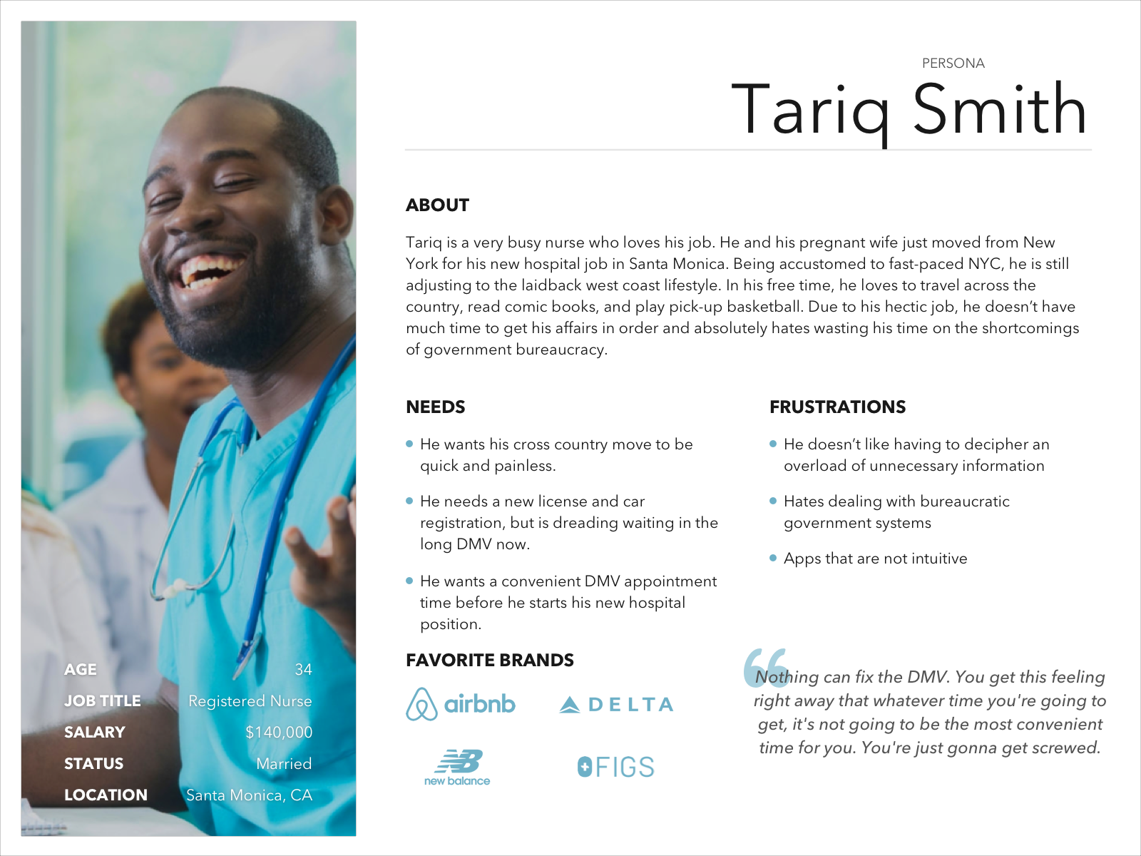
User Persona
Tariq Smith was created based on insights from our affinity maps. Tariq became the forefront of our design decisions and helped us keep the app user-friendly.
Problem Statement
Tariq, who feels stressed about his recent relocation and new job, needs to register his car and get his CA REAL ID on a date that will fit his hectic hospital schedule. In trying to save time and book an appointment in between shifts, he tries using the app. However, he feels it is nearly impossible to navigate the DMV app because of its scattered information, unclear directions, and difficulty booking an available appointment slot.
Customer Journey Map
To get a better understanding of Tariq’s experience while on the DMV app, my teammate created a customer journey map. This helped us pinpoint where Tariq struggled the most during the flow and where we should focus us during our redesign.

Tariq had to restart from the homepage two times during his task due to mislabeled buttons and the inability to go backwards in his flow. He was especially upset when the DMV only offered him one one appointment option.
Feature Prioritization
We wanted to make sure we were implementing features that Tariq would benefit from. We plotted all the features we were considering on our feature prioritization matrix and aimed for those that were essential yet low effort.
We added the following features:
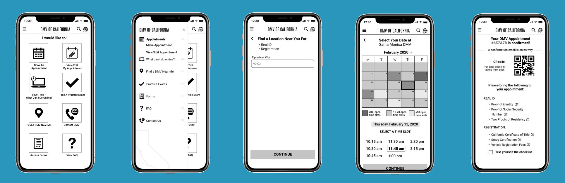
Confirmation page with appointment preparation checklist
Functioning appointment calendar
Auto location services
Clear indication of services at each location
Ability to sort results by distance and availability
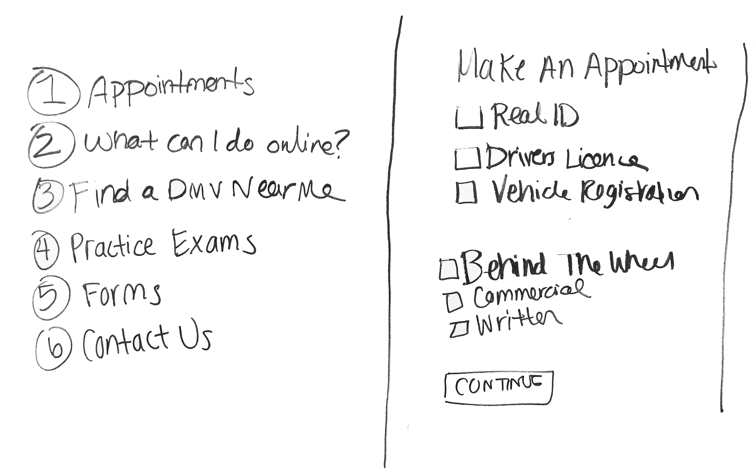
Wireflows
We examined the existing wire flows to identify the existing path to book an appointment. The overall path was confusing and caused a huge cognitive load for Tariq. The home page was an area of concern for our team because Tariq did not know where to click to book an appointment and would often find himself at a dead end. Based on a series of card sorting and results from our task analyses, we moved common DMV tasks to the primary navigation of the app.
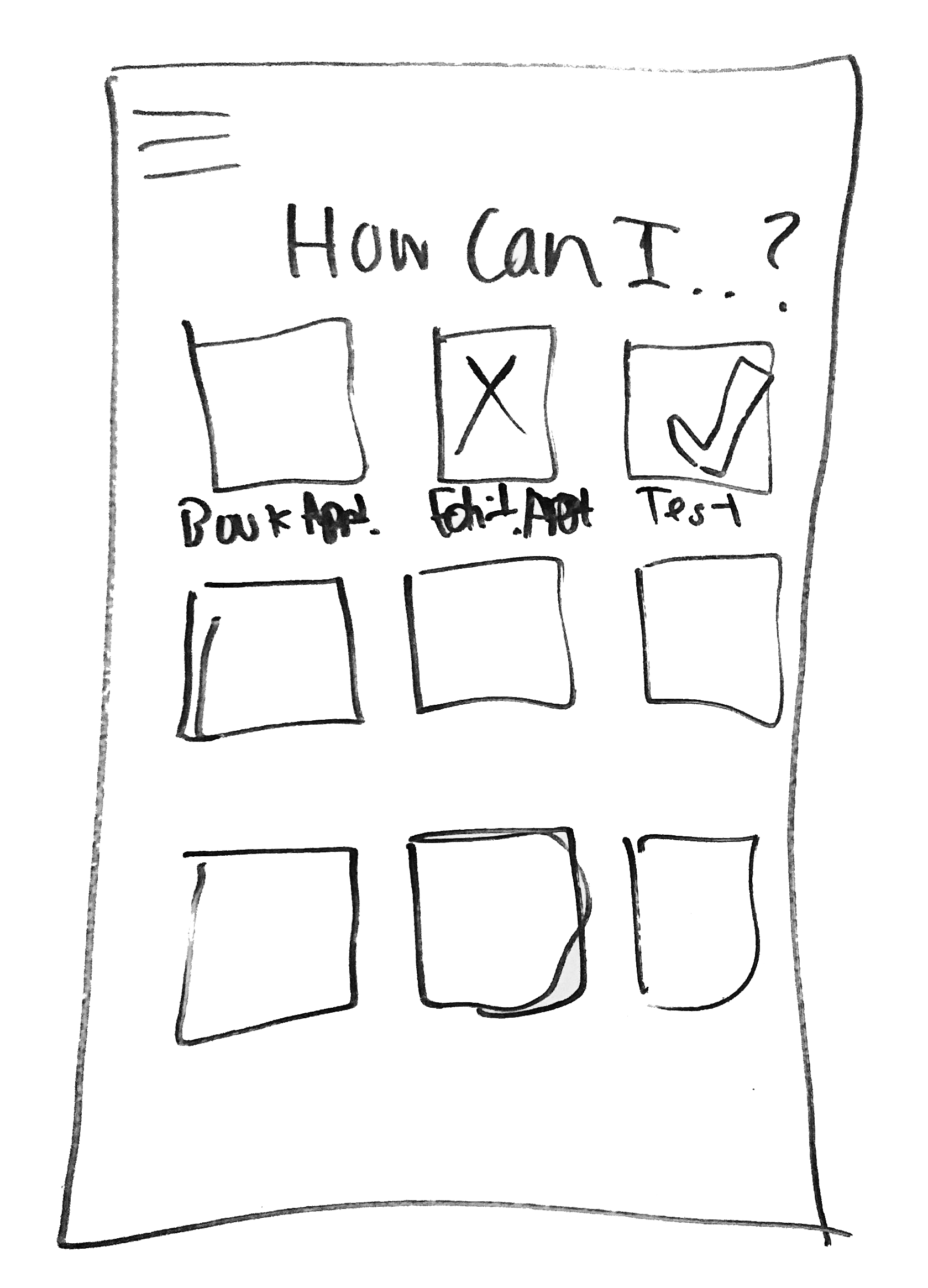
Design Studio
To begin our redesign, we completed a design studio session to start collaborating on our ideas. This practice was incredibly productive for us as we rapidly got our ideas out on paper and agreed on the design of our home page.
We then headed to the white board to finish up the sketches of the rest of the flow. Designing the calendar system was tricky for us. We wanted to make sure the calendar clearly showed the available times, but also gave users the flexibility of choosing different months or different DMV locations.

TEST AND ITERATE
Paper Prototype Usability Testing
With our improved user flow and general understanding of the new interface, we began creating our paper prototypes. Eager to hear the user’s opinion, we conducted five usability tests and used the feedback to iterate our designs:
We added a clear CTA button for ‘Select Your Date’
Updated copy on the appointments page from ‘More Details’ to ‘Location Details’
Added an explanation for the QR code
Automatically sent a confirmation code with the option to text as well

Medium-Fidelity Wireframes
We created our medium-fidelity wireframes based on our last iteration of the paper prototypes. We continued with nine more usability tests on our clickable prototype. This led to a few more iterations:
Added a month dropdown menu on the calendar page so users can skip to different months easily
Removed our color-coded key that indicated how many appointments were available on each date - the users did not find that information useful
Removed the copy that said how many time slots were available for each day
Added a sort by options on the appointment results page
Added save to google calendar feature
High-Fidelity Mockup

Once we we felt like we were getting consistent positive reactions to the prototype, we started working on the high-fidelity mockup. We incorporated shades of blue to portray dependability, trustworthiness, and security and included accents of green to hint towards a green, eco-friendly state. We kept the overall interface easy to read, with obvious CTA’s to keep Tariq focused on the task at hand.
TAKEAWAYS
This project highlighted the importance of user testing and iterationing on your designs. The design of this application was definitely a challenge to us as we had a lot to consider. But, as soon as you get the design in the hands of the user, everything starts to make sense. Although this was just a concept project, I believe this design can truly leave a positive impact on the state of California.
If time was not limited, I would have liked to complete a contextual inquiry. It would be interesting to explore how we could use the app to supplement the experience when you are at the DMV, not just to prepare for it. The time people spend in line at the DMV can be used more productively. I would also like to continue to build out the other features we considered, like live wait times or live chat.