

Poobah Records

The Client
Poobah Records is a record label and music store based in Pasadena, CA. They carry vinyl, cassette tapes, and CDs from primarily below-the-radar-artists. Poobah Records’ target customers are music lovers of all ages.
My Role: UX Researcher | UX/UI Designer
Duration: 2-Week Sprint | Concept
Tools: Sketch, InVision, Miro, Google Suite, Screencastify
The Goal
Poobah Records’ storefront is often buzzing with music junkies eager to find their next addition to their vinyl collection. However, their e-commerce website is a poor reflection of the store’s success. My goal was to create an enjoyable and successful online shopping experience for Poobah Record customers by implementing the ability to properly navigate, filter, search, and purchase music on their website.
MY UX PROCESS
RESEARCH & DISCOVER
Heuristic Evaluation
To start my research, I conducted a heuristic evaluation to identify potential usability errors on the existing website. By applying Jakob Nielson’s usability heuristics, I discovered a handful of violations which impacted the efficiency, satisfaction, and learnability of the website.

Certain violations were especially severe. For instance, the website lacked a search bar and filtering features which made it impossible to browse. The checkout process was also alarming. Poobah Records’ cart and checkout process were on an external website, making it impossible to access and edit the cart.
Comparative & Competitive Analysis
I then completed a comparative & competitive analysis to gain insight on how Poobah Records compared to other direct and indirect competitors. I also wanted to get a general sense of what the status quo was among record shops. I made sure to take a closer look at features that were evident across many competitors but were lacking in Poobah Records.

Through this process, it became clear to me that Poobah Records was not meeting industry standards. Users may notice huge discrepancies when visiting Poobah Records and would expect features, like the ability to browse by a specific term or use basic filters.
User Interviews
In order to improve the customer shopping experience on Poobah’s website, I had to thoroughly understand the users - what they expected when buying records online, along with their general habits and characteristics. I set out to conduct three user interviews and task analyses.
Each user was given the following tasks that I felt would confront the perceived issues with the site:
1. Add a Ras G album to your cart
2. Change your mind and remove that album and instead purchase another album of your choice
3. Add a T-Shirt to your cart and checkout

My user interviews were very insightful and highlighted many user pain points. An important takeaway was that although vinyl collectors love the act of hunting and discovering vinyl in person, when shopping online they usually have something specific in mind. Their path to purchase is often calculated - they read reviews, listen to their friends recommendations, and apply filters to find that perfect album at a perfect price.
Affinity Maps
To synthesize all my research and identify themes within my interviews, I completed a series of affinity maps. I was looking for patterns in behaviors, sentiments, and even non-verbal cues. Based on my research, I came to the following conclusions:
Users are looking for a good deal and want to save money
Users value their time and want to easily find the product they are looking for
Users value the process of discovery of an album
Users consider collecting and listening to vinyl as a special treat - a way to unwind
Users often research before purchasing a vinyl
Users are nostalgic- they appreciate hobbies from the past
IDEATE AND DESIGN
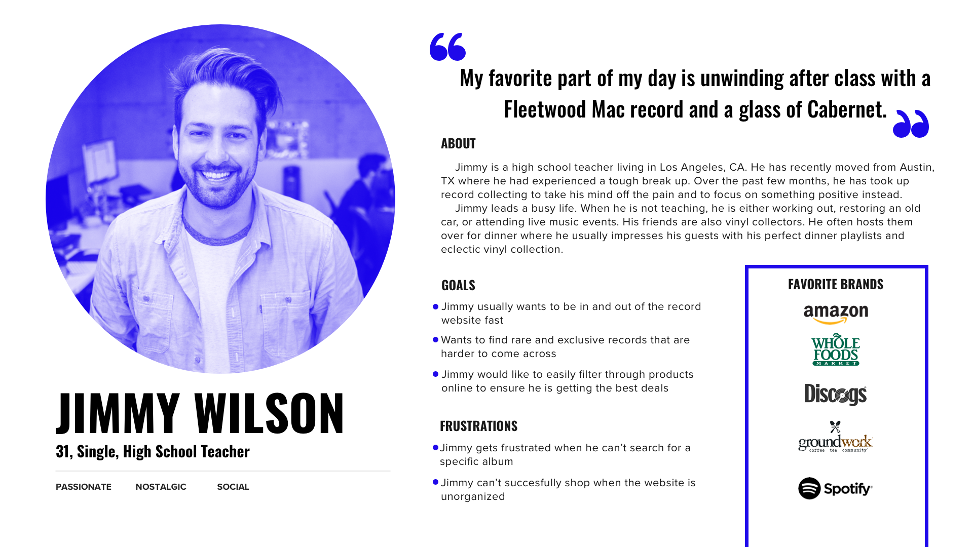
User Persona
Affinity mapping left me with a group of key insights that helped me personify Poobah Records’ ideal user and create my user persona - Jimmy. From this point on, I knew to keep Jimmy’s best interest in mind while making design decisions.
Problem Statement
Jimmy’s best friend can’t stop talking about a new record store he has recently discovered, called Poobah Records. He claims they have some awesome Hip-Hop/Instrumental records that are exclusive to Poobah Records. His birthday is coming up and Jimmy thinks it would be nice to buy his friend a vinyl from Poobah Records. However, his birthday is coming up very soon and with his busy teaching schedule, Jimmy can’t find the time to go to the store in person.
How might we help Jimmy buy his vinyl quickly and efficiently so it makes it in time for his friend’s birthday?
Customer Journey Map
I wanted to create visual of Jimmy’s experience on Poobah Records. By creating a customer journey map, I was able to understand Jimmy’s points of frustration or contentment with a quick glance.

Jimmy’s experience was mainly negative. He was frustrated with the lack of browsing capabilities with the website and could not understand why his cart was inconsistent. He also wanted more background information about the record store. Unfortunately, Jimmy could not complete his purchase and decided to resort to another website.
Feature Prioritization
Before beginning the redesign, I had to decide what features I should implement. I took into account Jimmy’s pain points along with my research results from the C&C Analysis to create a feature prioritization matrix. Features that Jimmy would immediately benefit from took priority.
Site Maps
I began my redesign by examining the information architecture. Based on the task analysis, it was clear that the main cause of Jimmy’s frustrations was the lack of proper Information Architecture. All genres, music, formats, and accessories were all thrown into the “shop” section with no way to filter through the product. Based on a series of open and closed card sorts, I reorganized the products and created new primary navigation.

Existing Site Map

Redesigned Site Map
User Flows
One of the biggest issues with the user flow was that Jimmy would often lose track of his cart items because there were two paypal carts running simultaneously that could not even be accessed from the universal navigation. I adjusted this in the new user flow by adding a single functioning cart to the site. I also brought the checkout flow back to the website and gave Jimmy the option to check out on Paypal.

Sketches
It was time to put pen to paper. I began sketching to start making some quick design decisions. I decided to implement an exaggerated search bar on the home page to cater to Jimmy when he is looking for a specific artist or record. I also liked the idea of including a faceted navigation- Jimmy would often tinker with different filters and this would allow him to have total control over his results easily.


TEST AND ITERATE

Paper Prototype Usability Testing
Now that I had a general idea of my design, it was time to test it on the user. I wanted to improve and iterate as much as possible before digitizing my designs.
Some important changes I made were:
Removed the double search bar on the home page
Added a pronounced Back To Browse button on the cart contents page
Made “vinyl type” its own category in the faceted navigation
Mid-Fidelity Wireframes


I built my mid-fidelity prototypes and began testing on my clickable prototype. My feedback led me quite a few more iterations:
Redesigned the check-out process by creating collapsible sections instead of one long page. This will keep Jimmy engaged and communicate clearly what is expected of him during checkout.
Updated the price range filter in the faceted navigation to not overlap prices.
Made the sort by button larger so that is easily clickable and catches Jimmy’s attention.
TAKEAWAYS
Designing for Poobah Records was very special to me. As a music lover myself, it was fascinating getting to know people who were so passionate about music. It was also very satisfying to know I was making decisions that would benefit the business and the users.
If time was not limited, I would have completed more user interviews. With more data, I would have been able to pull more conclusions and made sure this product satisfies their needs. I also would have liked to build out other important flows like purchasing from a wishlist. Within the next month, I plan to build out the high-fidelity mockup.